Branding Studio Vermilion
We set out to develop an art-lead studio that respects history while seizing the future.
The brand should have characteristics of modern design with clean shapes and a clever yet approachable boldness.
After rounds of research, we felt a strong pull to red and its connection to the energy of life.


It’s not just red, it’s Vermilion.

Vermilion, a hue originally derived from cinnabar, was one of the earliest pigments utilized by artisans.
We appreciate the specificity of vermilion as a parallel for precision, as well as the color’s history within the modernist movement.
Everything Connects

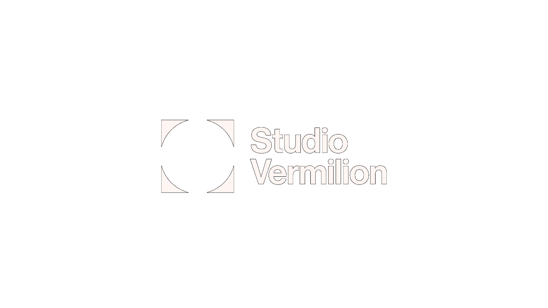
The symbol designed for Studio Vermilion is an illusory shape we call the lens.
The lens is made in the tradition of Bauhaus with simple geometric forms - a circle eclipsing a square leaving four triangle corners.
Inside this negative space creates a circle to be completed by the viewers mind.
This modernist mark represents how we look for the space that connects new ideas.
Font Exploration

Generative Exploration
Lockup
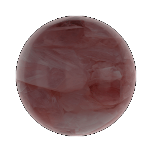
Material & Color
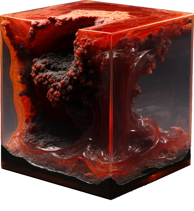
Vermilion Red
HEX #FF391F
RGB 255,57,31
CMYK 0,91,94,0
PANTONE Warm Red


Dark Grey
HEX #0F0F0F
RGB 15,15,15
CMYK 74,67,66,84
PANTONE Black 2 C

Warm White
HEX #FFF6F3
RGB 255,246,243
CMYK 0,3,2,0
PANTONE Custom

Light Pink
HEX #FFDBD6
RGB 255,219,214
CMYK 0,16,10,0
PANTONE 705 C
Summary